Old Iron Press
In 2021, I helped launch Old Iron Press—a female-led, independent publisher dedicated to retooled classics, the irreverent, the underdog, and the hybrid.
As a new publisher in a monopolized industry, it was essential to create a distinct brand identity that stood apart from traditional publishing. The resulting system—mainly inspired by twentieth-century constructivism—juxtaposes bold colors and typography with an intentionally small mascot (our very own underdog).
As a new publisher in a monopolized industry, it was essential to create a distinct brand identity that stood apart from traditional publishing. The resulting system—mainly inspired by twentieth-century constructivism—juxtaposes bold colors and typography with an intentionally small mascot (our very own underdog).


Meet Gutenborg, the mascot of Old Iron Press. The amalgamation of a 1969 Triumph Trident headlight, a well-preserved printing plate circa 1443, and a self-healing, energy-generating wheel.

With his headlamp looking up towards the sky, Gutenborg's proud and promising posture embodies the voice of the underdog.


A diverse series of manicules designed by Typeóca, the type foundry of Gabriel Figueiredo. I designed and illustrated a handful (pun intended) of additional, literary-inspired manicules to round out the set.

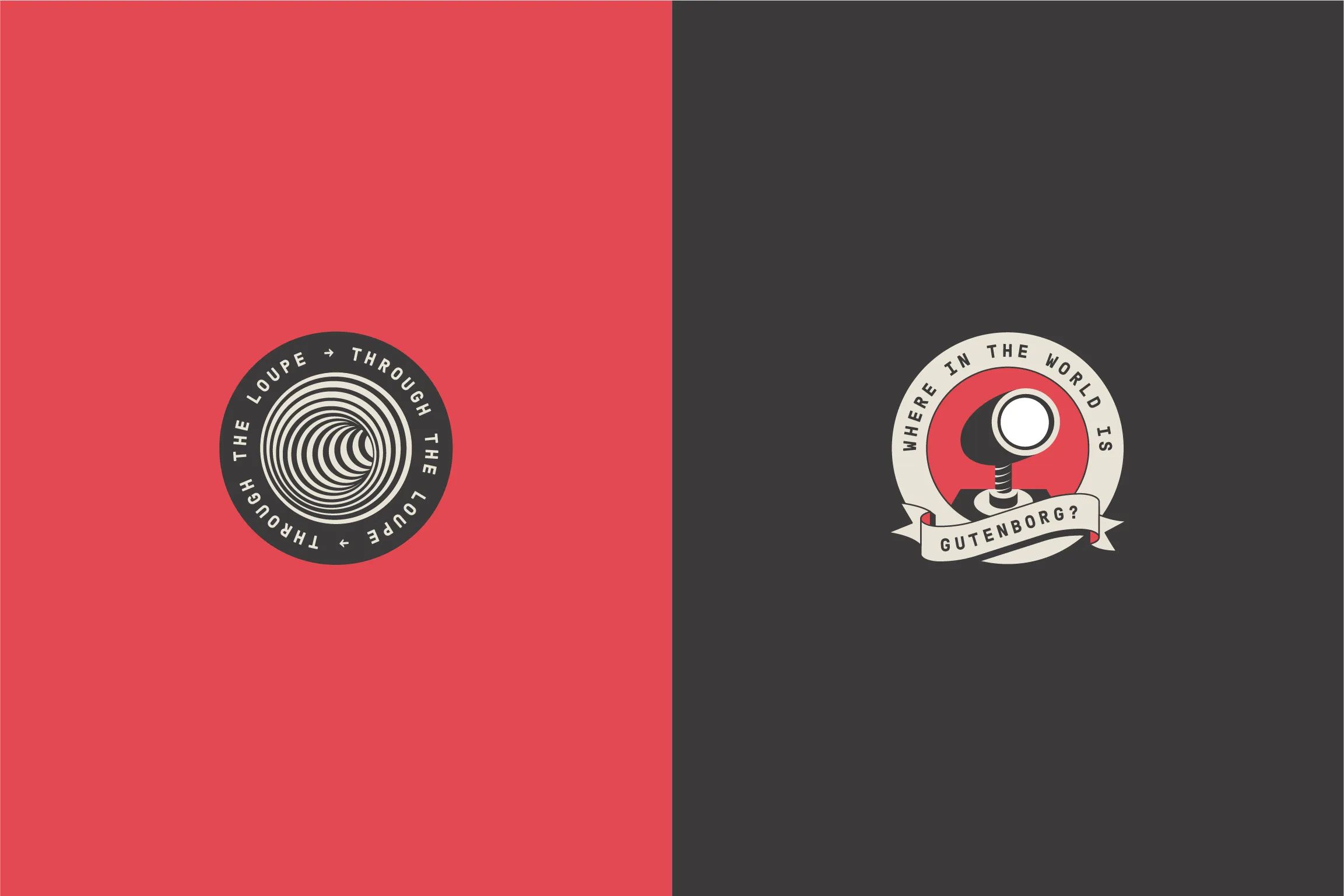
A pair of seal-inspired logos were created to represent micro-essay submission opportunities in OIP’s quarterly newsletter.
After the brand identity was established, OIP was in need of a responsive, CMS-based website for capturing submissions, telling OIP’s story, cataloging news, and managing sales and customer care for a line of writing-inspired merch.

An homage to the Apple Macintosh, circa 1984.


To be published in the fall of 2023, Playing Authors: An Anthology is the first book from the creators and editors at Old Iron Press. Inspired by the vintage game of Authors, a collection of 15 works written by 18 authors asks what it means to be just that—an author.
The resulting design explores balance in duality, taking cues from contrasting concepts of play and restraint.
The resulting design explores balance in duality, taking cues from contrasting concepts of play and restraint.


Using a subtle blind emboss, the book’s title hides in plain sight—the first moment of play.


A consistent and cohesive grid system was created to best fit the book’s format and variety of submission styles, including novellas, letters, poetry, and an interactive board game.


Explore more of my work.
Ion District
Brand, Web, Environmental
2023
Houston Zoo
Map, Environmental, Wayfinding
2023
Southern Smoke Foundation
Brand, Web, Print, Environmental
2022
Old Iron Press
Identity & Publication
2022
Hotel Amparo
Brand, Environmental
2019
Zanti Cucina Italiana
Brand, Print, Environmental
2019
Side Project Skateboards
Brand, Illustration
2018
Itza Wood
Brand, Print
2017